Personal Site Retrospective
2023-02-18
All personal sites before the age of 18 are subject to aging like milk. Unfortunately, so are some of the ones that come after the age of 18.
As a sort of coronation for this version of my personal site, I figured it'd be fun to look back at previous iterations of my personal site. However, these "previous iterations" aren't the pre-v2.0.0 verions of this site, but rather sites that looked radically different, contained drastically different content, and were hosted on different platforms with different URLs. Let the viewing and cringing commence!
Note: the use of "College Era" throughout this post very well might be a misnomer: there's no guarantee that I avoid graduate school for the rest of my life.
Innocence in the BCE (Before College Era)
My first attempts at a personal website came during Fall 2017, having taken both a web development and database class in high school. I actually remember creating the very first version of the site with the Wix, but ended up porting it to vanilla HTML, CSS, and JavaScript to flex my new skills and allow for more flexibility. I was able to recover most of the site, but it wasn't from Wix, nor was it from any of my own code repositories (I have a bad habit of wiping old projects instead of preserving them). Instead, I was lucky enough to have found it on my friend's GitHub profile. I'm not sure why he saved my website to his profile, but I've now forked it to my own profile and have it under a public archive so that everyone can view it.
But once I opened it, I kind of wished it had stayed deleted for all eternity.
The Bad
I know that critiques typically start with what the body of work does well, but I would honestly feel better getting what didn't work out of the way before talking about what did work.
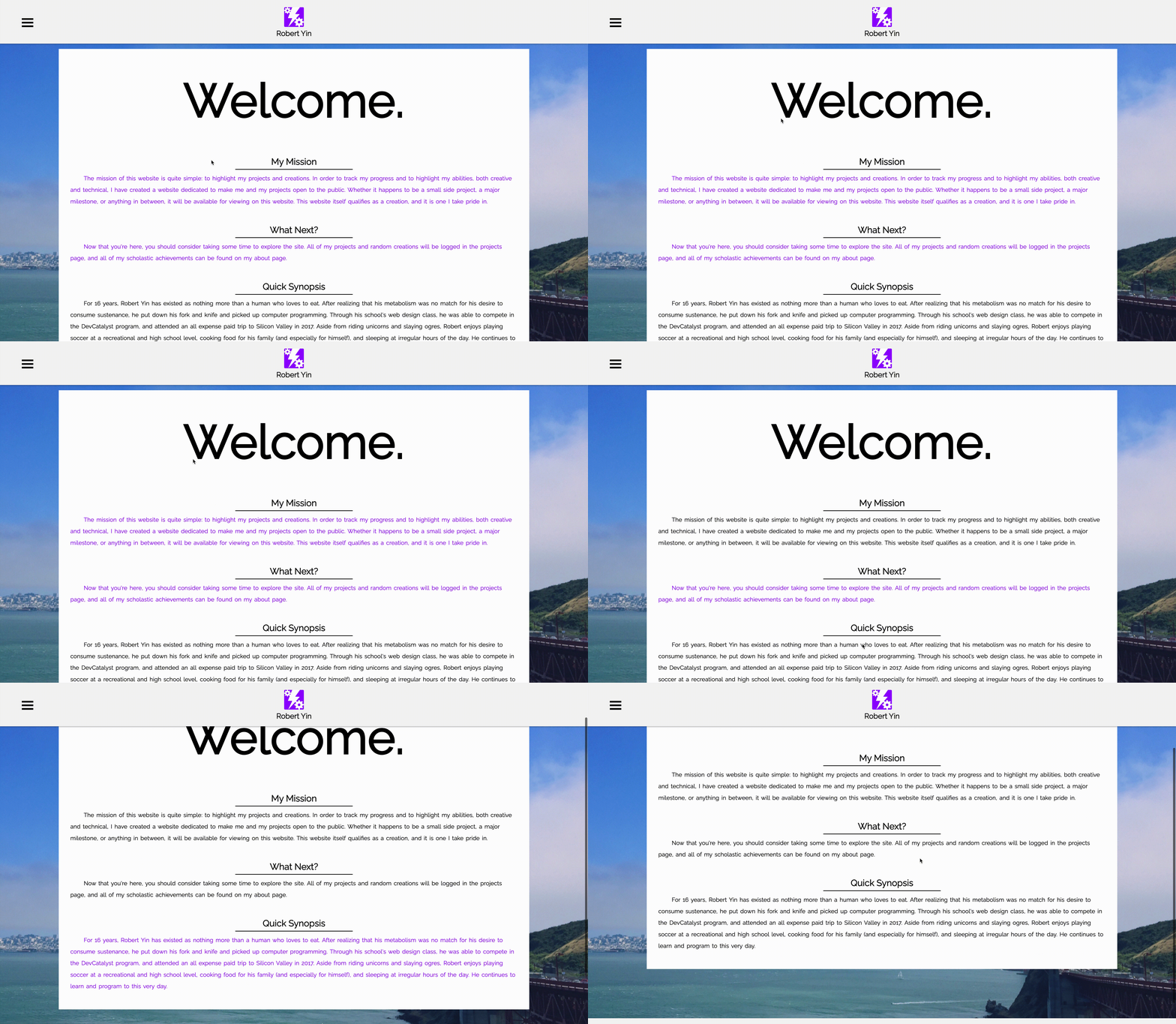
To start, some of the visual design decisions are poorly executed and one-dimensional, regardless if they were intentional or not. Raleway, the font the site uses for all of the text, is noted as a good display font but isn't as good for text. The footer text is lazily placed in the bottom-right of the footer with no spacing around it, and says nothing more than "Designed By Robert Yin."
 What an underwhelming footer.
There were also some design choices that didn't seem to have any reasonable justification: why are some of the body headers unselectable by the cursor, and why is the rest of the text purple on no background color when selected? Was I intentionally prioritizing mediocre aesthetics over accessibility? Any why did I choose the color purple when it clearly doesn't mesh with the background image and is only ever reinforced by the logo in the header?
 Good luck trying to copy and paste any of my headers.
Lastly, some of the content on this site clearly has my tenth-grade name on it because it comes off as incredibly unhelpful and awkward to read. The synopsis, for example, was an extreme exaggeration of my relationship with food at the time and just wasn't appropriate to put on the Home page:
For 16 years, Robert Yin has existed as nothing more than a human who loves to eat. After realizing that his metabolism was no match for his desire to consume sustenance, he put down his fork and knife and picked up computer programming.
And as much as I love my siblings, this quote probably shouldn't have been on the About page:
He is a chorky lumpkinella.
Rebecca Yin, Robert's Youngest Sister
Even the professional information came off weird: did I really need to format my JavaScript knowledge as "JavaScript (Rudimentary)" or to try and flex my "all expense paid trip to Silicon Valley?"
 There is a sweet, misguided charm to expressing my SQL knowledge as "SQL/phpMyAdmin."
There's so much more bad meat for me to sink my teeth into on this site, but I'm willing to call it a day for this portion of the critique and blame it all on "inexperience," even if it doesn't actually apply (I'm looking at you, navigation menu and image lightbox scripts that were blatanly copied from StackOverflow, W3Schools, or some other resource for novice web developers).
The Good
Most of the nice things about this site revolve around being the "right idea," which is to say that despite the flaws there is good intent behind them all.

As I've progressed through college and experienced some of the corporate life that comes with software engineering, I've appreciated keeping non-technical and creative endeavors close to me. Past me seems to agree:
Aside from riding unicorns and slaying ogres, Robert enjoys playing soccer at a recreational and high school level, cooking food for his family (and especially for himself), and sleeping at irregular hours of the day.
The mission statement is quite wholesome and makes me jealous of how hopeful I used to be about my computer science career:
The mission of this website is quite simple: to highlight my projects and creations. In order to track my progress and to highlight my abilities, both creative and technical, I have created a website dedicated to make me and my projects open to the public. Whether it happens to be a small side project, a major milestone, or anything in between, it will be available for viewing on this website. This website itself qualifies as a creation, and it is one I take pride in.
Ultimately, there's a lot on this site that reminds me that software and the web hasn't always been bleak and marred by the messes of adult life: sometimes it can be fun and simple.
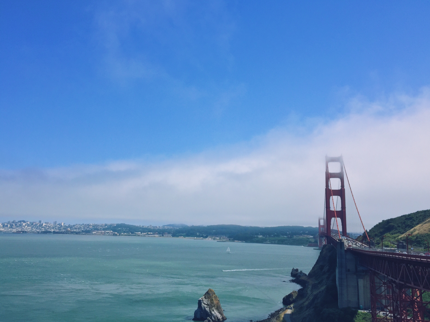
 Seeing this image of the Golden Gate Bridge always reminds me of how I got started with computer science in the first place.
Improvement in the CE (College Era)
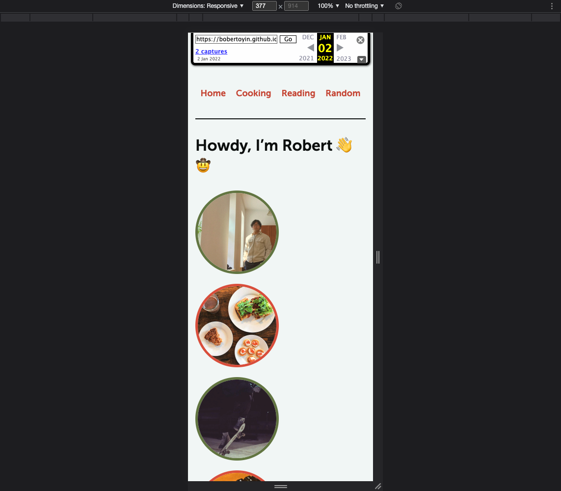
This is where the journey back in time gets tricky. I had many iterations of sites built using Jekyll during my first three years of college, but I ended up deleting the source code without saving a copy anywhere. The best I could do was pull a single day's version of the Home page from the Wayback Machine.
The Good
The design and formatting of the site is more consistent and multi-dimensional: there's a color scheme that isn't too bad to look at, Liquid templating means that HTML elements are used more consistently, and there's a healthy usage of emojis wherever applicable!
 Maybe emojis aren't actually a critical design choice, but they sure are fun.
I also think this website still gives off a relatively youthful and spry energy that isn't too far off from the high school site, but is a little more reserved and mature.
The Bad
One issue that this site has is the number of unnecessary pages in the navigation bar and on the site: "cooking", "reading", and "random" content could all easily be placed into a single "blog" page with tags for each category. However, I can't totally falt my past self for making this mistake because this criticism comes from a wiser Robert who is aware of the fact that many static site generators are "blog-focused".
This next issue is a bit of a nitpick, but the site doesn't handle responsiveness all that well. This could've easily been remedied by picking up a CSS framework that could automatically handle responsiveness. TLDR; don't let non-frontend developers write too much CSS by hand.
 Sure, it's not bad, but it's not great either.
Lastly, I don't love the idea of making the homepage a glorified copy of my resume, which is exactly what I did for this site. Although trying to showcase your work and abilities isn't a bad thing, it makes more sense to highlight content that can't fit on a resume (e.g., blog posts!).
Consistency in the PCE (Post-College Era)
There are two big takeaways from this journey back in time that I plan to keep with this new iteration of my personal site:
- Don't do historical revisionism. Mistakes are good for learning and making consistent improvements.
- Sometimes simpler is better, even if it means not looking as shiny and fun to play with as other personal sites.
Will my site be guaranteed to look the same from now on? Maybe not, but at least I can push changes knowing that improvement is always possible.